Creative Ways to Use Tongue and Groove Panelling at Home
*Collaborative Post
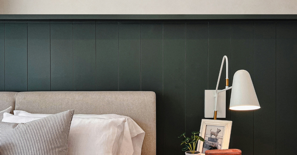
Tongue and groove panelling has a reputation for being traditional, and while it does have deep roots in classic interior design, it’s far more adaptable than that label suggests. The clean, linear structure of the boards means it slots into everything from rustic cottages to contemporary flats without missing a beat.
If you’ve been wondering how to use it in your own home, here are six ideas worth considering.
1. As a kitchen splashback
Kitchens are already busy spaces. Between cabinetry, appliances, worktops, and everything on display, there’s a lot competing for visual attention. A tongue and groove splashback works well precisely because it doesn’t add to the noise; it brings texture and warmth without drawing focus away from everything else going on in the room.
The flat, understated lines of the boards complement both traditional shaker kitchens and more minimal, slab-front designs. And practically speaking, the surface is easy to wipe down after cooking; a damp cloth with mild soap is all it takes to deal with most splashes.
2. Paired with wallpaper
One of the more creative applications of tongue and groove panelling is using it in combination with wallpaper rather than instead of it. Install the panels at half-wall height, running from the floor upward, and then let the wallpaper take over above.
The contrast between the linear panel texture below and a patterned paper above creates a layered, considered look that’s hard to achieve with either element alone. Whether you opt for something bold and graphic or a softer, more traditional repeat, the key is thinking about how the panel colour and the paper work together. A trim or dado rail at the join finishes the look cleanly.
3. Mix panel heights across walls
There’s no rule that says every wall in a room needs to be treated the same way. Running full-height panelling on one wall and half-height on another creates a subtle contrast that adds interest without feeling busy or overdone.
You can take this further by extending the panelling onto the ceiling, something that works particularly well when the ceiling boards are laid horizontally rather than vertically, creating a natural visual shift as the eye moves from wall to ceiling. Door frames and archways are also worth thinking about; panelling around these architectural features adds depth and a sense of craftsmanship to the overall space.
4. Panel drench for total immersion
For something more dramatic, panel drenching – covering walls, ceiling, and sometimes even the floor in matching panelling – creates a fully immersive environment that feels considered from every angle.
With tongue and groove, this approach works particularly well when a single paint colour is used throughout. The consistent tone blurs the boundary between wall and ceiling, giving the room a soft, enveloping quality. It doesn’t have to feel overwhelming either; the right neutral can make a drenched room feel calm and cocooning rather than claustrophobic. Picture rails, artwork, and decorative objects can still do their work within the space.
5. Go horizontal to change the proportions
Most people default to vertical panelling, and for good reason; it draws the eye upward and makes ceilings feel higher. But in narrower rooms or spaces where you want to emphasise width rather than height, running the boards horizontally changes the dynamic entirely.
Horizontal lines lead the eye across the wall rather than up it, making a room feel broader and more grounded. Wider boards tend to produce a calmer, more contemporary result; narrower boards give something more detailed and traditional in character. If you’re considering a horizontal layout, take note of other horizontal lines already present in the room – a fireplace shelf, a window sill, a television – and think about how the panelling will interact with them.
6. Coordinate with your existing wood tones
In rooms where wood is already present, e.g. flooring, furniture, shelving, it’s worth thinking carefully about how tongue and groove panelling will sit alongside those existing tones.
A close match in wood tone creates a harmonious, unified look. A slightly lighter or darker shade adds gentle contrast without disrupting the overall palette. The key is thinking about warmth versus coolness: a warm oak floor will generally sit better with warm-toned panels than with something cooler and greyer. That said, an exact match is rarely necessary; what matters most is that the tones feel considered rather than accidental.
Tongue and groove panelling from Panels By Sofia rewards a little creative thinking. Used well, it’s one of the most versatile tools available for transforming a room.
*This is a collaborative post. For further information please refer to my disclosure page.
Related Posts:
Could Landlords Be A More Compassionate Landlord?

People in positions of power have to be compassionate. If they can inform their actions with empathy and feeling, the Read more
Where to start with choosing a local plumber (what to look for)

When you move to a new area, you need to set up a whole new network of local services again. Read more
3 Reasons People Resist Moving House (And How You Can Overcome Them)

*Collaborative Post Many families reach a point where they know it’s time to move from their existing home. Whether you’re Read more
Essential Tips for Transforming Your Bathroom: A Guide to Stylish and Functional Renovations
Renovating a bathroom can breathe new life into your home, turning an often-overlooked room into a sanctuary of style and Read more