
How to Tell Crystals Apart: Practical Tips for Designers
*Collaborative Post
Designers who work with crystals know the frustration: what looks like a stunning piece on screen turns up dull, cloudy, or visibly inconsistent in person. Or worse, you’re handed a batch of mixed stones at a market or in a studio and told they’re all “the same.” Are they? Probably not.
In an ideal world, every supplier would offer clear labeling, high-res photos, and transparent sourcing. But in practice, you need to be able to trust your own eyes—and your tools. Identifying different types of crystals isn’t about passing some mystical test. It’s about understanding structure, behaviour, and finish. And maybe having a bit of healthy skepticism, too.
Look for Physical Clues in Structure and Surface
When comparing crystals, start with the basics: cut quality, clarity, weight, and surface finish. These factors aren’t just cosmetic. They’re the result of how a crystal was manufactured (or mined), and they leave a trail of visual evidence behind.
Precision-cut crystals like Swarovski tend to be extremely consistent. Facets are sharp and symmetrical. Color saturation is deep and even. If a batch has uneven coating, bubbles inside, or off-centre holes—that’s a sign you’re likely looking at a lower-grade alternative.
If you’re unsure what you’re working with, you might want to check out these tips for distinguishing between crystals to learn how to assess materials without relying on guesswork or vague supplier descriptions.
Use Light (and Shadow) as a Test Tool
This sounds obvious, but: hold it up to the light.
Good crystals reflect and refract. They produce fire. You should see that rainbow-like dispersion when the light hits correctly. It won’t be as dramatic as a diamond, but you’ll notice the difference between a crisp, sharp glint and a dull surface flash. One catches the eye; the other looks flat, almost like plastic.
Pay attention to shadows, too. How does the crystal affect light on the surface it’s sitting on? Does it throw patterns? Is the color clean or does it fade into a grey murk when placed against white?
The way a crystal interacts with its environment tells you a lot. It doesn’t need a lab setup. Just a desk lamp, some natural daylight, and a neutral surface for comparison.
Trust Your Hands (Not Just Your Eyes)
Weight can be deceptive—especially when dealing with small sizes—but it still matters. High-quality crystals tend to feel denser and cooler to the touch. This isn’t a foolproof test (glass and plastic can be convincing), but it adds another layer of input when you’re evaluating a new material.
Texture is another clue. Run your fingers lightly across the surface. Premium stones should feel smooth, clean-edged, and tightly cut. If the facets are blunt, uneven, or feel rough under a nail, that’s a red flag.
Some designers swear by the sound test—tapping crystals against each other to listen for tone differences. That one might be a stretch unless you have a trained ear and a very quiet room, but still… it’s part of the multi-sensory process.
What About Coatings, Foils, and Effects?
Special finishes—like AB (Aurora Borealis), shimmer, or metallic foils—can be gorgeous, but they also make identification harder. They reflect more light, obscure internal clarity, and sometimes mimic the look of a higher-end stone.
A simple test: flip the crystal over. Many flatbacks and sew-ons will reveal the coating edge on the reverse side. If it looks flaky, scratched, or inconsistent in colour, that usually signals a mass-market coating.
Premium crystals generally apply effects using vapour deposition or similar high-grade processes. You’ll notice the finish is sealed cleanly, sits flush with the cut, and won’t chip with minor friction.
Build a Reference Library (Seriously, Just Do It)
If you work with crystals regularly, there’s no substitute for hands-on reference. Buy samples from known sources. Label them. Store them properly. Compare new batches against your reference materials.
It doesn’t take long to build a collection of trustworthy benchmarks, and it saves endless time second-guessing suppliers or project materials down the line. Plus, having samples at hand helps when you need to match colors or reorder a discontinued style.
Digital tools can help here, too. Take close-up photos of your samples in different lighting and keep a folder on your phone. You can cross-check on the go.
Final Thoughts
Being able to tell crystals apart isn’t just a neat party trick—it’s a practical skill that protects your work, your reputation, and your budget. Whether you’re sourcing for couture, product design, or custom orders, the ability to assess materials accurately sets you apart.
Perfection isn’t the goal. Familiarity is. You won’t always get it right on the first glance, and that’s fine. But over time, you’ll start to notice the details that matter and trust your instincts more with every project.
*This is a collaborative post. For further information please refer to my disclosure page.
Related Posts:
Loose Grown Diamonds: Select the Ideal Diamond for Your Jewelry
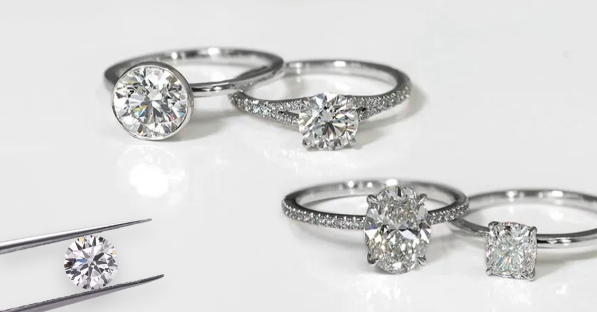
Introduction: Selecting the ideal diamond is thrilling and critical in creating captivating jewelry pieces. Loose Grown Diamonds has a selection Read more
Top 5 Benefits of Using a Custom Diamond Painting Kit for Personalized Art Piece
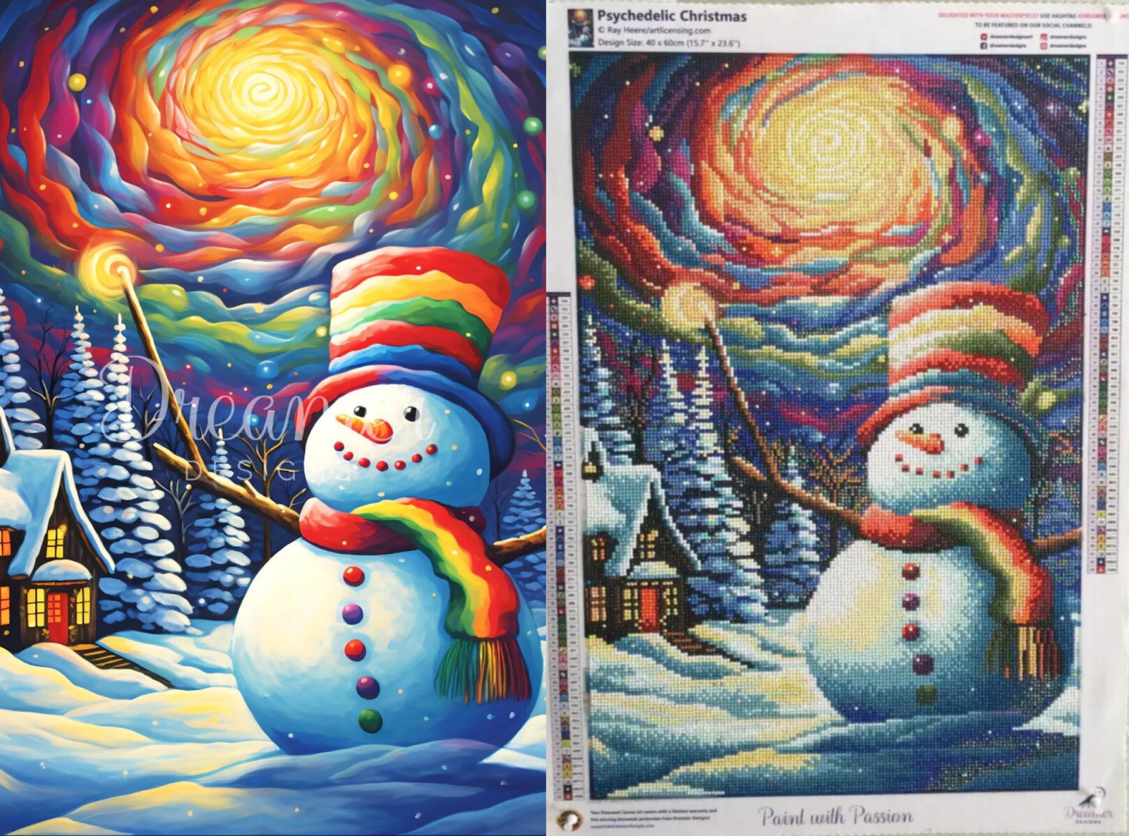
Diamond art painting is a new trend attracting the attention of art enthusiasts and those who take it as a Read more
What Are The Benefits of Yoga?

Yoga emanated from India over 5000 years ago. It focuses on flexibility, strength and breathing. Yoga practitioners do so by Read more
Using Mindfulness To Achieve Some Zen After School

If you have followed me for a while now, you will know that Jake started school last September and that Read more